Sunday 29 May 2011

Visualizing Python call graphs with jsPlumb

When analyzing or debugging complex code it can be a great help to have a call graph at your disposal. In this article we look at Python's bundled trace module to generate a call graph and at jsPlumb, a Javascript library to render an interactive visual representation.

Trace can do more than coverage analysis

In a previous article we saw how we could use Python's trace module to see which lines in in our code where actually executed when we run some function. The same module can provide us with a list of functions that are called by other functions. This is as simple as providing some extra parameters as can be seen in the example code below:
import trace
 
t=trace.Trace(count=1,trace=0,countfuncs=1,countcallers=1)
t.runfunc(f)
r=t.results()
This snippet will run the function f and in the end we will have a CoverageResults object in r. We can print these results with the write_results() method but a more graphical representation is preferred. Now the underlying data structures are not well documented some inspection and examination of the source code shows that we have a member called callers that hold a record of which function called which. It is a dictionary with a a complex key and a simple value: the value contains a count of how many times in a function another function is called, the key is a tuple of tuples (caller, callee) where eacht member has three parts: (module, filename, functionname). Lets see how we can use this information to visualize the call graph.

jsPlumb

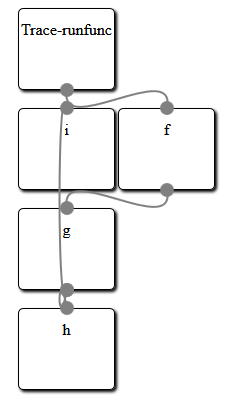
The idea is to represent each function as a simple box and draw lines to indicate which function calls which other function. Now we could try to build an application based on some graphics library but rendering graphical boxes is something web browser are good at, so why not use HTML to represent our graph and a web browser to render the stuff? All we need is some way to draw attractive lines connecting those boxes. Enter jsPlumb, a versatile Javascript libraray to do just that. And a lot more as well: once a graph is drawn it lets you interact with the boxes to rearrange them as you see fit.
The example code provided at the end of this article will generate a number of div elements, one for each Python function encountered. It also generates a bit of Javascript to let jsPlumb draw its connecting lines. The HTML produced looks like this:
<html><head>
<script type="text/javascript" src="http://explorercanvas.googlecode.com/svn/trunk/excanvas.js"></script>
<script type="text/javascript" src="http://ajax.googleapis.com/ajax/libs/jquery/1.4.4/jquery.min.js"></script>
<script type="text/javascript" src="http://ajax.googleapis.com/ajax/libs/jqueryui/1.8.2/jquery-ui.min.js"></script>
<script type="text/javascript" src="jquery.jsPlumb-1.2.5-all-min.js "></script>
<link rel="stylesheet" href="callgraph.css" type="text/css" media="all" />
</head><body>
<div id="i" class="box" style="left:200px;top:200px">i</div>
<div id="h" class="box" style="left:200px;top:400px">h</div>
<div id="Trace-runfunc" class="box" style="left:200px;top:100px">Trace-runfunc</div>
<div id="g" class="box" style="left:200px;top:300px">g</div>
<div id="f" class="box" style="left:300px;top:200px">f</div>
<script>
jsPlumb.Defaults.Connector = new jsPlumb.Connectors.Bezier(50);
jsPlumb.Defaults.DragOptions = { cursor: 'pointer', zIndex:2000 };
jsPlumb.Defaults.PaintStyle = { strokeStyle:'gray', lineWidth:2 };
jsPlumb.Defaults.EndpointStyle = { radius:7, fillStyle:'gray' };
jsPlumb.Defaults.Anchors = [ "BottomCenter", "TopCenter" ];

$("#Trace-runfunc").plumb({target:"f"});
$("#g").plumb({target:"i"});
$("#f").plumb({target:"g"});
$("#g").plumb({target:"h"});
</script>
</body></html>
It consists of a number of script tags to include the jQuery library and jsPlumb together with the explorer canvas so everything will work on Internet Explorer just as well.
Next is a list of div elements with a box class and a final script elements that calls the plumb method for each connection. This final bit of Javascript is preceded by a few lines that set some default for the lines that will be drawn. These are fully documented on the jsPlumb site.
When this HTML and Javascript is viewed with a webbrowser the result looks something like the image preceding the HTML sample code. Creating a layout for a graph where nothing overlaps is a difficult job and clearly fails here, but the beauty of jsPlumb is that it provides an interactive graph: you can click and drag any box on the screen to rearrange the graph in any way. An example is shown in the image on the left where we have dragged about some of the boxes to provide a clear separation.

From CoverageResults to an interactive graph

So our problem boils down to generating suitable HTML and Javascript from the data provided in the CoverageResults object. I'll provide the full code without much explanation as it should be clear enough. It certainly isn't a sterling example of clean coding but it works:
def f():
 for i in range(10):
  g(i)
  
def g(n):
 return h(n)+i(n)

def h(n):
 return n+10

def i(n):
 return n*8
 
def box(name,pos=(400,300)):
 return ('<div id="%s" class="box" style="left:%dpx;top:%dpx">%s</div>'
   %(name,pos[0],pos[1],name))

def connect(f,t):
 return '$("#%s").plumb({target:"%s"});'%(f,t)

if __name__ == "__main__":
 import trace
 from random import randint
 
 t=trace.Trace(count=1,trace=0,countfuncs=1,countcallers=1)
 t.runfunc(f)
 r=t.results()

 print("""<html><head>
<script type="text/javascript" src="http://explorercanvas.googlecode.com/svn/trunk/excanvas.js"></script>
<script type="text/javascript" src="http://ajax.googleapis.com/ajax/libs/jquery/1.4.4/jquery.min.js"></script>
<script type="text/javascript" src="http://ajax.googleapis.com/ajax/libs/jqueryui/1.8.2/jquery-ui.min.js"></script>
<script type="text/javascript" src="jquery.jsPlumb-1.2.5-all-min.js "></script>
<link rel="stylesheet" href="callgraph.css" type="text/css" media="all" />
</head><body>""")

 boxen={} # unique names, values are positions
 for f,t in r.callers:
  fk=f[2].replace('.','-') # identifiers with dots cannot be used as (x)html ids
  tk=t[2].replace('.','-')
  if not fk in boxen:
   boxen[fk]=[200,100]
  if not tk in boxen:
   boxen[tk]=[200,100]
  boxen[tk][1]=boxen[fk][1]+100
 for b in boxen:
  for b2 in boxen:
   if b != b2 and boxen[b] == boxen[b2]:
    boxen[b2][0]+=100
 for b in boxen:
  print(box(b,boxen[b]))

 print("""<script>
jsPlumb.Defaults.Connector = new jsPlumb.Connectors.Bezier(50);
jsPlumb.Defaults.DragOptions = { cursor: 'pointer', zIndex:2000 };
jsPlumb.Defaults.PaintStyle = { strokeStyle:'gray', lineWidth:2 };
jsPlumb.Defaults.EndpointStyle = { radius:7, fillStyle:'gray' };
jsPlumb.Defaults.Anchors = [ "BottomCenter", "TopCenter" ];
""")
 for f,t in r.callers:
  fk=f[2].replace('.','-')
  tk=t[2].replace('.','-')
  print(connect(fk,tk))
 print("</script>")
 print("</body></html>")

Sunday 22 May 2011

Python and Javascript, using the Flot plugin, part 6

In the sixth installment of this series we look at how we can make the graph more interactive by making full use of the extensibility of the Flot plugin.

Creating interactive plots

The Flot plugin mimics most other jQueryUI plugins in that although it works perfectly well without any configuration options it also provides a number of ways to extend its functionality. Here we will see how we may attach a hovering label to any point in the graph, something that may prove useful if the graph consists of many points. An example is shown in this image (the mousepointer itself is not visible in this screenshot):

  var p = $.plot($("#tempandwind")  ,da ,{
    series: { lines: { show: true }, points: { show: true } },
    xaxis : { mode:"time",ticks:12,twelveHourClock:false},
    y2axis: { position:"right"},
    grid  : { hoverable: true }
  });

  $("#tempandwind").bind("plothover",highlight);

The Flot plugin does not generate the custom plothover events by defaults so we need to turn that on as can be seen in line 5. With plothover events enables we can now bind a function to this event as can be seen in the last line.

The Flot website shows a number of interesting examples on how to enhance an extend the Flot plugin. The highlight() we define here is a slightly adapted version of some of the Javascript behind this example. Lets have a look at our implementation:

var previousPoint = null;

function highlight(event, pos, item) {

  if (item) {
    if (previousPoint != item.dataIndex) {
      previousPoint = item.dataIndex;

      $("#tooltip").remove();
      var y = item.datapoint[1].toFixed(2);
               
      showTooltip(item.pageX, item.pageY,
        item.series.label + " = " + y);
    }
  } else {
    $("#tooltip").remove();
    previousPoint = null;   
  }
};

Any function bound to the plothover event is passed three arguments: an event object, the position in the canvas and an item argument that holds graph specific data, i.e. the x and y values of the datapoint that we are hovering above, its coordinates in the canvas and the label of the dataseries that the point belongs to. If item is null or undefined we are not hovering above a datapoint. We check for this in the code and remove the tooltip if so.

Because we do not want to redraw the hovering information if we are still above the same data point we check if the index in the series of datapoints is different from the one we stored in the global variable previousPoint. If this is the case, we remove the tooltip, convert the value of the datapoint to a number with only two decimals to keep things readable and call the showTooltip() function to draw the a label at to correct position.

function showTooltip(x, y, contents) {
  $('
' + contents + '
').css( { position: 'absolute', display: 'none', top: y + 5, left: x + 5, border: '1px solid #fdd', padding: '2px', 'background-color': '#fee', opacity: 0.80 }).appendTo("body").fadeIn(200); };

The showTooltip() function is straight from the example on the Flot page but deserves some explanation because it shows off some nifty jQuery features.

It creates a div element ans styles it directly with the css() method. Its display attribute is initially none as the element is added to the body element with the appendTo() method but is made gradually visible with the fadeIn() method. Each of these methods returns the element it is operating on so all methods can be chained.

Sunday 15 May 2011

Python and Javascript: using the Flot plugin, part 5

Using the Flot plugin

In article 5 of this series we look at how we may actually configure the Flot plugin to show the data.

The Javascript code: minimalweather.js

Let's have a look at a rather minimal implementation of the client side of our app. It will only show temperature and wind speed but it is a rather good example of what is possible. The Javascript code is encapsulated in a jQuery $(document).ready() function. This way we ensure that we only convert HTML elements to jQuery widget when we're absolutely sure they are present.

The first step we take is setting some general AJAX parameters. We set cache to false which will instruct jQuery to add a _ (underscore) parameter to every AJAX call. This parameter will have a random value and this will make the URL different each time, thereby preventing the browser to cache result. After all we are not interested in stale weather data. We also set async to false. AJAX calls normally return immediately but signal completion to a function that is given to them as a parameter. However, because our graphs consist of multiple dataseries we want to retrieve the data from more than one datasource. To draw the complete graph we need all data to be available, so by setting async to false we don't start doing anything else unless the last AJAX call is finished. This is a bit against the grain (after all the first A in AJAX stands for asynchronous) but it does make out code simpler.

The second task is to set a default for the reporting period and level of detail in the graphs. The period might be a day, a week or a month and the default level of detail is a average value per hour. PyWWS compatible weather stations are normally capable of logging in a much finer detail and that is what we retrieve if detail is set to raw. (My weather station can log a value every five minutes).

Next we define two functions: hourly(), that will issue two getJSON() calls to retrieve temperature and windspeed averages over the last hour and raw() that will do the same but for 5 minute intervals. Because we designed the server side of the application to produce JSON serialized data all the hard work of converting this data to arrays of timestamp/value pairs in a safe way is done by the getJSON() function which will pass the result as the data argument to the function it calls on completion.

$(document).ready(function(){
  $.ajaxSetup({cache:false,async:false});

  var temp_out;
  var wind_ave;
  
  var period="day";
  var detail="hourly";
   
  function hourly(){
   $.getJSON('./hourly/temp_out' ,{"period":period},
   function(data){ temp_out = data; });
   $.getJSON('./hourly/wind_ave' ,{"period":period},
   function(data){ wind_ave = data; });
   }
  
  function raw(){
   $.getJSON('./raw/temp_out' ,{"period":period},
   function(data){  temp_out = data; });
   $.getJSON('./raw/wind_ave' ,{"period":period},
   function(data){  wind_ave = data; });
  }

Now that we have functions in place to retrieve data we need something to convert these two data sets (temperature and wind speed) to an object that can be passed as an argument to the Flot plugin. That is what the setdata() function does: it creates an object that defines two dataseries with an appropriate label. It also defines a second y-axis to use by the wind speed dataseries. We initialize the da variable to hourly data.

  var da;
  
  function setdata(){
   da = [
    {data:temp_out,label:"temperature"},
    {data:wind_ave,label:"wind",yaxis:2}
    ];
  };
   
  hourly();
  setdata();

With the data present and a data argument ready we can finally convert the div with the tempandwind id to a graph. The flot plugin is a little different from most plugins as it does not provide a member function on any jQuery selection (unlike for example the button plugin which can be called as $("#mybutton").button() ). The Flot plugin just provides a plot() function which is passed a jQuery selection as its first argument. The second argument is an object which describes the data series and the final argument is an option object. Here we configure all series to show lines as well as points and configure the x-axis to behave as a time axis with a maximum of twelve tick marks. If it decides to show hours as ticks we inform it to use a 24 hour clock (it might show days as well, it decides that automatically although this may be set explicitly). Note that the width and height of the HTML element that we want to convert to a graph must be set explicitly beforehand. We have take care of that in the HTML contained in the basepage.html file.

  
  var p = $.plot($("#tempandwind")  ,da ,{
    series: { lines: { show: true }, points: { show: true } },
    xaxis : { mode:"time",ticks:12,twelveHourClock:false},
    y2axis: { position:"right"}
  });

We will also configure some buttons to let the user interact with the graph so we must define some way to reload and redisplay data. We therefore define a replot() function which will retrieve either hourly data or detailed data based on the contents of the detail variable and then create a new data description object. We then use the setData() method of the Flot plugin to indicate we have new data and its setupGrid() method to recalculate things like axes and ticks. The graph is then redrawn by calling the draw() method.

  function replot(){
 if (detail == "hourly") {
  hourly();
 }else{
  raw();
 }
 setdata(); 
 p.setData(da);
 p.setupGrid();
 p.draw();
  };

Interaction with the graph is now a simple matter of binding functions to click events. These functions set either the detail or the period variable to a suitable value and then call the replot() function.

  
 $("#d2").click(function(){
  detail="raw";
  replot();
 });

 $("#d1").click(function(){
  detail="hourly";
  replot();
 });

 $("#p1").click(function(){
  period="day";
  replot();
 });
 
 $("#p2").click(function(){
  period="week";
  replot();
 });
 
 $("#p3").click(function(){
  period="month";
  replot();
 });

What is left (although we could have done it much earlier) is to style the tabs and buttons with regular jQueryUI widgets:

 
 $("#tabs").tabs();
 $("#detail").buttonset();
 $("#period").buttonset();
});

The result of all this work is a functional web application that shows temperature and wind speed on its first tab:

And it is interactive of course: Clicking the week button for example results in this overview:

Of course we there is a lot more we can do but that is covered in coming articles.

Other parts of this series

Wednesday 11 May 2011

Python 3 Web Development Beginner's Guide, published!

Work on my new book, Python 3 Web Development Beginner's Guide, is done and both the e-book version and the print version are now available.

Python 3 Web Development Beginner's Guide is available now. Both the e-book version and the print version are now available on the publishers website as well as on the websites of the major on-line book stores.

Writing the book was hard work, but the attention and skills of the people at Packt Publishing and the reviewers of the book were a great help. Kudos to them!

Sunday 8 May 2011

Python and Javascript: using the Flot plugin, part 4

First steps in creating a web application

It is nice to have some modules that serve up weather data but it is of course not enough. In this article we show how to use those modules as components in a CherryPy application. We also see what the HTML looks like that we use to structure the information in the web application and load all necessary Jascript files and supporting CSS.

Serving a CherryPy application

The first steps in setting up our web application is importing the cherrypy module and the classes from the weather package that we created earlier:

import os
        
current_dir = os.path.dirname(os.path.abspath(__file__))

import cherrypy

from weather.services import Hourly,Raw,Monthly

basepage = "".join(open(os.path.join(current_dir,'basepage.html')).readlines())

In the last line we also read in a file called basepage.html that we will look at later as it forms the basis of our application (we use a separate file so that we don't have to mix to much Python and HTML. Syntax highlighters don't like that). The next step is to configure the tree of URLs that serve the different kinds of data:

class Root:

    hourly = Hourly('/home/michel/sitescripts/pywws/weatherdata')
    raw    = Raw('/home/michel/sitescripts/pywws/weatherdata')
    monthly= Monthly('/home/michel/sitescripts/pywws/weatherdata')
    
    @cherrypy.expose
    def index(self):
        return basepage

We configure the server to listen on any address and by default it will listen on port 8080. If you need another port you may configure this with the server.socket_port option.

                        
cherrypy.config.update({'global':{'server.socket_host':'0.0.0.0'}})    

Finally we start the CherryPy server by passing an instance of the Root class we defined to serve the application to the quickstart() function. We pass in additional configuration items to make sure we have a log file in a place we can access and that any reference to an URL that starts with /static is mapped to a directory with the same name relative to the location from where started the script.

If we save this script as weatherservice.py we can run it with python weatherservice.py. To test it we may direct our webserver either to the name of the host where we run the script or to localhost, e.g. http://localhost:8080/ or http://www.example.com:8080/.

cherrypy.quickstart(Root(),
        config={
            '/':{
                'log.access_file'  : os.path.join(current_dir,"access.log"),
                'log.screen'       : False
                },
            '/static':{
                'tools.staticdir.on'  :True,
                'tools.staticdir.dir' :current_dir+"/static"
                }
               }
)

Structuring data with HTML

We serve a single basic HTML page to structure all the data elements in our web application and use AJAX calls from a small piece of Javascript to fill in the actual data. The base page starts of with a head section that accomplishes several things: loading the jQuery and jQueryUI libraries, provinding access to a graphical canvas, even in Internet Explorer (that is what the conditional comments do) and load the Flot plugin. The final two lines incorporate our own application specific Javascript (weather.js) and CSS file (weather.css).
<html>
<head>
<title>Weather Overview</title>
<script src="http://ajax.googleapis.com/ajax/libs/jquery/1.5.1/jquery.min.js" type="text/javascript"></script>
<script src="http://ajax.googleapis.com/ajax/libs/jqueryui/1.8.11/jquery-ui.min.js" type="text/javascript"></script>
<link rel="stylesheet" href="http://ajax.googleapis.com/ajax/libs/jqueryui/1.8.11/themes/smoothness/jquery-ui.css" type="text/css" media="all" />
<!--[if IE]><script language="javascript" type="text/javascript" src="/static/js/flot/excanvas.min.js"></script><![endif]-->
<script language="javascript" type="text/javascript" src="/static/js/flot/jquery.flot.js"></script>
<script language="javascript" type="text/javascript" src="/static/js/weather.js"></script>
<link rel="stylesheet" href="/static/css/weather.css" type="text/css" media="all" />
</head>

The body of the HTML is structured with two div elements. The first one is structured with an unordered list in a pattern that is suitable to apply jQueryUI's tab widget. Each of the tabs contains another div, each with its own id and marked as a graph class. These we will convert to graphs with the Flot plugin later.

<body>
<div id="tabs">
  <ul>
    <li><a href="#tabs-1">Temperature and wind</a></li>
    <li><a href="#tabs-2">Humidity and rain</a></li>
    <li><a href="#tabs-3">Summary and extremes</a></li>
    <li><a href="#tabs-4">Indoor values</a></li>
  </ul>
  <div id="tabs-1">
    <div id="tempandwind" class="graph" style="width:840px;height:300px"></div>
  </div>
  <div id="tabs-2">
    <div id="humidityandrain" class="graph" style="width:840px;height:300px"></div>
  </div>
  <div id="tabs-3">
    <p>here will be a table</p>
  </div>
  <div id="tabs-4">
    <div id="indoorvalues" class="graph" style="width:840px;height:300px"></div>
  </div>
</div>

The second div will hold radio buttons to select a reporting period and the level of detail in the graphs. These will be styled as jQueryUI button widgets and fitted with click handlers to make the graphs interactive.

<div id="nav">
 <div id="period">
 <input type="radio" id="p1" name="period" checked="checked" />
 <label for="p1">Day</label>
 <input type="radio" id="p2" name="period"/>
 <label for="p2">Week</label>
 <input type="radio" id="p3" name="period" />
 <label for="p3">Month</label>
 </div>
 <div id="detail">
 <input type="radio" id="d1" name="detail" checked="checked" />
 <label for="d1">Low</label>
 <input type="radio" id="d2" name="detail"/>
 <label for="d2">High</label>
 </div>
</div>
</body>
</html>

In the next part we will look at the necessary Javascript and how to use the Flot plugin.

Other parts of this series

Sunday 1 May 2011

Coverage testing in Python: combining the unittest and trace modules

Just testing is not enough, you need to know how much of your code you are actually testing to obtain any sort of confidence. In this article I show you my approach to combining the built-in unittest and trace modules to perform unit testing and coverage testing in one go, without introducing external dependencies.

Coverage tests in Python

If you want to check how much of your code is covered by your tests you can of course use any number of available modules (coverage.py is an excellent starting point) but this does introduce a dependency on external code, something you might want to avoid.

Checking coverage however, is just as simple as building unit test with Python's bundled modules. In the example below we use unittest to write our unit tests and use the less known trace module to tally any lines executed when we execute our test runner.

Example unit test

The code to test is a rather silly example of a function that has three branches. The bulk of the code is about the unit tests and the final (from line 28 onward) shows how we can execute the test runner (unittest.main()) within the trace framework.

def f(a):
 if a>0: 
  return a
 elif a==0:
  raise ValueError()
 return -a
# end of coverage

if __name__ == "__main__":
 import unittest
 import trace
 from os.path import dirname,abspath
 from collections import defaultdict
 from re import compile,match
 
 eoc=compile(r'^\s*# end of coverage')
 
 class TestFunction(unittest.TestCase):
  
  def test_int(self):
   self.assertEqual(3,f(3))
   self.assertEqual(-3,f(-3))
  
  def test_float(self):
   self.assertEqual(3.0,f(3.0))
   self.assertEqual(-3.0,f(-3.0))

 t=trace.Trace(count=1,trace=0)
 t.runfunc(unittest.main,exit=False)
 r=t.results()
 
 linecount = defaultdict(int)
 for line in r.counts:
  if line[0]==__file__:
   linecount[line[1]]=r.counts[line]
 
 with open(__file__) as f:
  for linenumber,line in enumerate(f,start=1):
   if eoc.match(line) : break 
   print("%02d %s"%(linecount[linenumber],line),end='')

Using the trace module

We first create an instance of a Trace object initialized with a trace parameter set to zero to prevent printing every line it encounters. (Full documentation is available on the Python site.) Then we invoke the runfunc() method with unittest.main as its first parameter. This will trace the test runner and collect the results in the Trace instance. The extra exit=False is passed to the test runner and will prevent it from stopping the program once the tests are done (after all, we still want to do something with the results from the trace).

The next step is to retrieve the results (line 30). These results are available as a dictionary which keys are (filename,linenumber) tuples and the corresponding values the number of times this line is executed. We convert this to a default dictionary for those lines that are present in the current source file (line 34). This dictionary is indexed by line numbers.

The final step is to iterate over the lines in the current source file until we encounter a line that signal the end of the tested code (line 39). We print those lines with the number of times they were executes. The result may look like this

..
----------------------------------------
Ran 2 tests in 0.031s

OK
00 def f(a):
04      if a>0:
02              return a
02      elif a==0:
00              raise ValueError()
02      return -a

The tests ran ok but as is immediately obvious from line 10 is that we missed an important branch that is not covered by our unit tests. Note that the line with the def statement is also not executed by our tests but this is to be expected as function definitions are only executed when the function is compiled, not when it is run.

Remarks

We do use more than just the document API of the trace module because the trace module as published has a major drawback: it not only collects statistics but only offers a public API that immediately prints those results. This not convenient when you want to postprocess the results or present them in a different way. We are therefore more or less forced to access the underlying data (the counts attribute in the object returned by the results() method.